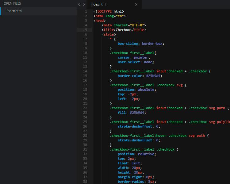
Достаточно часто на сайтах приходится использовать элемент checkbox для создания различных фильтров, опросов и прочего функционала. Стандартные чекбокс элементы выглядят довольно невзрачно и могут снижать конверсию сайта. Ниже представлена пара вариантов, как можно улучшить визуальное оформление данных элементов.
Вариант первый
<!DOCTYPE html>
<html lang="en">
<head>
   <meta charset="UTF-8">
   <title>Document</title>
   <style>
      * {
          box-sizing: border-box;
      }
      .checkbox-first__label{
         cursor: pointer;
         user-select: none;
      }
      .checkbox-first__label input:checked + .checkbox {
         border-color: #25b9d4;
      }
      .checkbox-first__label .checkbox svg {
         position: absolute;
         top: -2px;
         left: -2px;
      }
      .checkbox-first__label input:checked + .checkbox svg path {
         fill: #25b9d4;
      }
      .checkbox-first__label input:checked + .checkbox svg polyline {
          stroke-dashoffset: 0;
      }
      .checkbox-first__label:hover .checkbox svg path {
         stroke-dashoffset: 0;
      }
      .checkbox-first__label .checkbox {
         position: relative;
         top: 2px;
         float: left;
         width: 20px;
         height: 20px;
         margin-right: 8px;
         border-radius: 3px;
         border: 2px solid #c8ccd4;
      }
      .checkbox-first__label .checkbox svg {
         position: absolute;
         top: -2px;
         left: -2px;
      }
      .checkbox-first__label .checkbox svg path {
         fill: none;
         stroke: #25b9d4;
         stroke-width: 2;
         stroke-linecap: round;
         stroke-linejoin: round;
         stroke-dasharray: 71px;
         stroke-dashoffset: 71px;
         transition: all 0.6s ease;
      }
      .checkbox-first__label .checkbox svg polyline {
         fill: none;
         stroke: #fff;
         stroke-width: 2;
         stroke-linecap: round;
         stroke-linejoin: round;
         stroke-dasharray: 18px;
         stroke-dashoffset: 18px;
         transition: all 0.3s ease;
      }
      .checkbox-first__label > span {
         pointer-events: none;
         vertical-align: middle;
      }
      .checkbox {
         position: relative;
         top: 2px;
         float: left;
         width: 20px;
         height: 20px;
         margin-right: 8px;
         border-radius: 3px;
         border: 2px solid #c8ccd4;
      }
      .checkbox-first__input {
         position: absolute;
         width: 0;
         height: 0;
         opacity: 0;
         z-index: -1;
      }
   </style>
</head>
<body>
<div class="checkbox-first">
   <label for="checkbox-one" class="checkbox-first__label">
      <input id="checkbox-one" type="checkbox" class="checkbox-first__input">
      <div class="checkbox">
         <svg width="20px" height="20px" viewBox="0 0 20 20">
            <path d="M3,1 L17,1 L17,1 C18.1045695,1 19,1.8954305 19,3 L19,17 L19,17 C19,18.1045695 18.1045695,19 17,19 L3,19 L3,19 C1.8954305,19 1,18.1045695 1,17 L1,3 L1,3 C1,1.8954305 1.8954305,1 3,1 Z"></path>
            <polyline points="4 11 8 15 16 6"></polyline>
         </svg>
      </div>
      <span>Вариант 1</span>
   </label>
</div>
</body>
</html>
Вариант второй
<!DOCTYPE html>
<html lang="en">
<head>
   <meta charset="UTF-8">
   <title>Document</title>
   <style>
      * {
         box-sizing: border-box;
      }
      .checkbox-second input {
         opacity: 0;
         z-index: -1;
         position: absolute;
         margin: 10px 0 0 20px;
      }
      .checkbox-second__text {
         cursor: pointer;
         position: relative;
         padding: 0 0 0 40px;
      }
      .checkbox-second__text:before {
         content: '';
         position: absolute;
         top: -1px;
         left: 0;
         width: 20px;
         height: 20px;
         border-radius: 4px;
         background: #cdd1da;
         box-shadow: inset 0 2px 3px rgba(0,0,0,.2);
         transition: 0.3s;
      }
      .checkbox-second__text:after {
         content: '';
         top: 1px;
         left: 2px;
         opacity: 0;
         width: 16px;
         height: 16px;
         background: #fff;
         position: absolute;
         border-radius: 4px;
         box-shadow: 0 2px 5px rgba(0,0,0,.2);
         transition: 0.3s;
      }
      .checkbox-second input:checked + .checkbox-second__text:before {
         background: #9ae051;
      }
      .checkbox-second input:checked + .checkbox-second__text:after {
         opacity: 1;
      }
   </style>
</head>
<body>
   <label class="checkbox-second">
      <input type="checkbox" />
      <div class="checkbox-second__text">Вариант 2</div>
   </label>
</body>
</html>